Top 5 Design Studios in UK
The UK has a number of highly rated design studios that set the working standards in the trade. These design studios are well known for having the skill, talent and practical ability, working with clients from across the globe. Here we look at what makes each one successful.
1: Studio Sutherl&
 This small multi-award-winning design agency in London was founded in 2014 by Jim Sutherland who had previously worked at hat-trick design that he had co-founded with Gareth Howat in 2001. Studio Sutherl& is a small design studio with a full-time staff of two, yet consistently delivers clever, beautiful and successful designs. Studio Sutherl& keeps design seemingly effortless, yet witty enough to leave you smiling.
The agency works by surrounding itself with the best artists, architects, writers, strategists, fashion designers and others to suit each particular project, allowing it to take on a wider range of potential projects.
Recent work for Start-rite Shoes demonstrates how the tiny studio's compelling approach can appeal to a major high street brand, and it shows that Sutherland’s main focus in business is to do good work since everything else will flow from that and only work for people you like. An example of this is the 2018 campaign for Start-Rite shoes, a 200-year-old children’s shoe company. The brief was to create a new headline typeface for a business anchored in the belief that the best children’s shoes should help them move freely. Studio Sutherl& created a bespoke font called ‘Typefeet’ (where the serifs become small feet) where the characters are used sparingly and combined with a matching typeface 'TypeSansFeet'.
Previous works have included the rebranding of the Arts Society, Natural History Museum, Wimbledon Lawn Tennis, Land Securities, Williams F1, Prostate Cancer UK, National Museums Scotland, Welsh National Opera, and the University of Westminster. Studio Sutherl& has also designed more than 50 stamps for Royal Mail to date.
2: North
Co-founded in 1995 by British designers Sean Perkins and Stephen Gilmore, North is best known for having worked on a series of iconic corporate identities for a folio of renowned clients. Perkins completed an MA at the Royal College of Art, London and worked at Wolff Olins, Cartlidge Levene and Imagination London before setting up his own design studio, North, also in London.
North has a staff of 14 and whilst once an outsider in the business is now one of the most powerful UK design agencies, able to simplify corporate challenges through visually striking and innovative corporate identities for companies such as RAC, First Direct, Barbican, Land Registry, Telewest, The Royal Mint and Carat. This simplicity is built around the essential elements that an organisation is known by its name, logo or symbol, colour, typographic style and visual language. Through the unique way in which these are put together, North creates the building bricks of an organisation’s DNA.
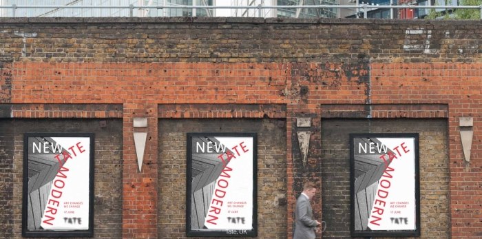
North has worked with Tate to reconfigure the museum’s typographic expression. North built on the existing brand by refreshing and strengthening what was working well. Tate’s highly distinct logo retained the custom typeface, ’Tate Pro’, but its use was more carefully controlled. Reducing multiple versions of the logo with both lower-case and capital letter options was streamlined to one consolidated logo to be used in print, digital media and merchandising with the additional aim to unify Tate Britain, Tate Liverpool, Tate St Ives and Tate Modern.
3: ManvsMachine
Founded in London in 2007, which another office in Los Angeles, ManvsMachine is a design and motion studio that has grown into a multi-award winning, multi-national team of 19 creative specialists directing and producing acclaimed branding, commercials, animation, film and print.
Their client base includes Channel 4, Nike, Audi and Honda for whom they produce consistently good work they can be proud of. Now the team is the largest it has even been yet managing to get the right combination of briefs that answer different needs, enough time for research and development, whilst at the same time keeping open access to the creative stimuli needed whether illustrative, procedural, live action, VFX, identity or branding.
The ManvsMachine 2018 campaign for Nike’s Air Max Day was the fourth global campaign for the studio. Continuous adaptation and development from the previous campaigns saw ManvsMachine use live action, 3D, typographical design, and cel animation in its biggest campaign for Nike yet. This was a chance for the studio to show an alternate side to the motion graphics focused work it has such a strong reputation for and is said to have been a massive step for the studio. As a campaign to turn imagination into reality, ManvsMachine’s work is a playfully executed example of how combining different disciplines can make for a cohesive whole, with milk explosions, on set raves and people dancing in giant inflated suits.
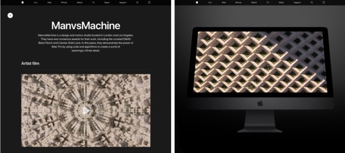
Apple approached ManvsMachine and challenged it by pushing the iMac Pro to its limits. Using CGI architectural structures covered in high‑resolution photographic textures and embellished using a custom‑designed system to control the foliage, architectural details and other nuances, the result is a monolithic structure of massive scale and incredible detail.
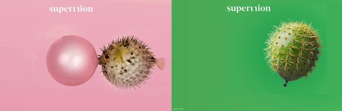
4: Superunion
Great brands united to form Superunion in January 2018, Superunion. Five world-class businesses, including the UK’s The Partners, have joined together as an agency to build businesses through powerful, upstream creativity. Superunion has united Brand Union's strategic strength and global influence, The Partners' award-winning creative reputation, Lambie-Nairn's expertise in identity and motion graphics, Addison's unique understanding of corporate audiences, content development and digital delivery and the premium packaging offer of VBAT. The combined expertise and creativity make more powerful and enduring connections that bring people and organisations closer together, with Jim Prior as Global CEO and Simon Bolton as Executive Chairman.
A recent brief was to return Land Rover as the world’s premium SUV brand of choice, to define what British Premium meant and how it could own the space by speaking to premium and luxury experts around the world. This means simplifying Land Rover’s brand strategy, exploring the company’s original DNA to determine how to stay relevant. A brand film was initially used as an internal audience film but before becoming external facing content for Land Rover. As well as the main brand, specialist identities and guidelines were created for the Land Rover Experience division and Special Vehicle Operations. The brand now has the same craftsmanship of its products, with communication channels across all markets.
Another project was to transform UK retail pioneer Argos into a digital super-retailer. Selling thousands of products to over 70 per cent of UK households through its catalogues and 845 stores, Argos pioneered the concept of mass value retail. Superunion has created a new brand strategy, personality and own-brand portfolio to help Argos become the digital super-retailer. This bold strategy created a confident personality with bold typography and splashes of colour to digital and print catalogues, outdoor, TV and mobile advertising, to the website and stores. From employee engagement initiatives and service innovation ideas to a new approach to the catalogue and a Christmas Wishlist app, Superunion continues to work with Argos to keep one step ahead.
5: Pentagram
Founded in 1972, Pentagram’s recent high-profile projects have focused on graphics and identity, architecture and interiors, products and packaging, exhibitions and installations, websites and digital experiences, advertising and communications. With 183 staff located in London, New York, Berlin and Austin, great design spanning five decades has come from passion, intelligence and personal commitment.
More recent projects have included a visual identity for UK charity Nesta, a new typographic and story-driven identity for the Old Vic theatre, and visual identity, dynamic typeface and pattern generator for Graphcore, an AI start-up in Bristol.
Creating a visual identity for Nesta, one of Britain's most prolific innovation foundations working for social change, including a challenge fund to help tackle the threat of antibiotic resistance and a national education programme designed to help young people understand technology. At different times Nesta partners, endorses, leads, facilitates and shapes a project. So, the visual representation of its multifaceted work led Pentagram to present a modern but classic universe of planets that shift and change, giving the effect of effervescent energy that breeds constant action and is a visual style applied across all Nesta’s sub-brands with the addition of a new strapline ‘See Spark Shape Shift’.